Jacob Banks | Yonder

Yonder is a project by Jacob Banks—an artist known for building rich, cinematic worlds around his music. Marking our third collaboration together, the project extended far beyond a traditional album release, evolving into a multi-phase creative rollout across digital, physical and live experiences.
Structured as three distinct “books,” Yonder unfolded over time—each chapter released as its own body of work before ultimately coming together as a complete collection.

The opportunity
Rather than a single album drop, Yonder was designed as a journey—one that would be experienced in stages, with each release building anticipation and deepening the world around the music.
The challenge was to create a visual identity that could support this structure. Each “book” needed to feel complete in its own right, while still contributing to a larger, cohesive narrative. At the same time, the project needed to translate seamlessly across streaming platforms, physical formats, merchandise, and live performance.
The ambition was clear: treat every moment as intentional, extending the lifecycle of the project and creating a sense of progression across each release.

What we did
We developed a visual language that could evolve across all three chapters of Yonder, while maintaining a strong and recognisable core.
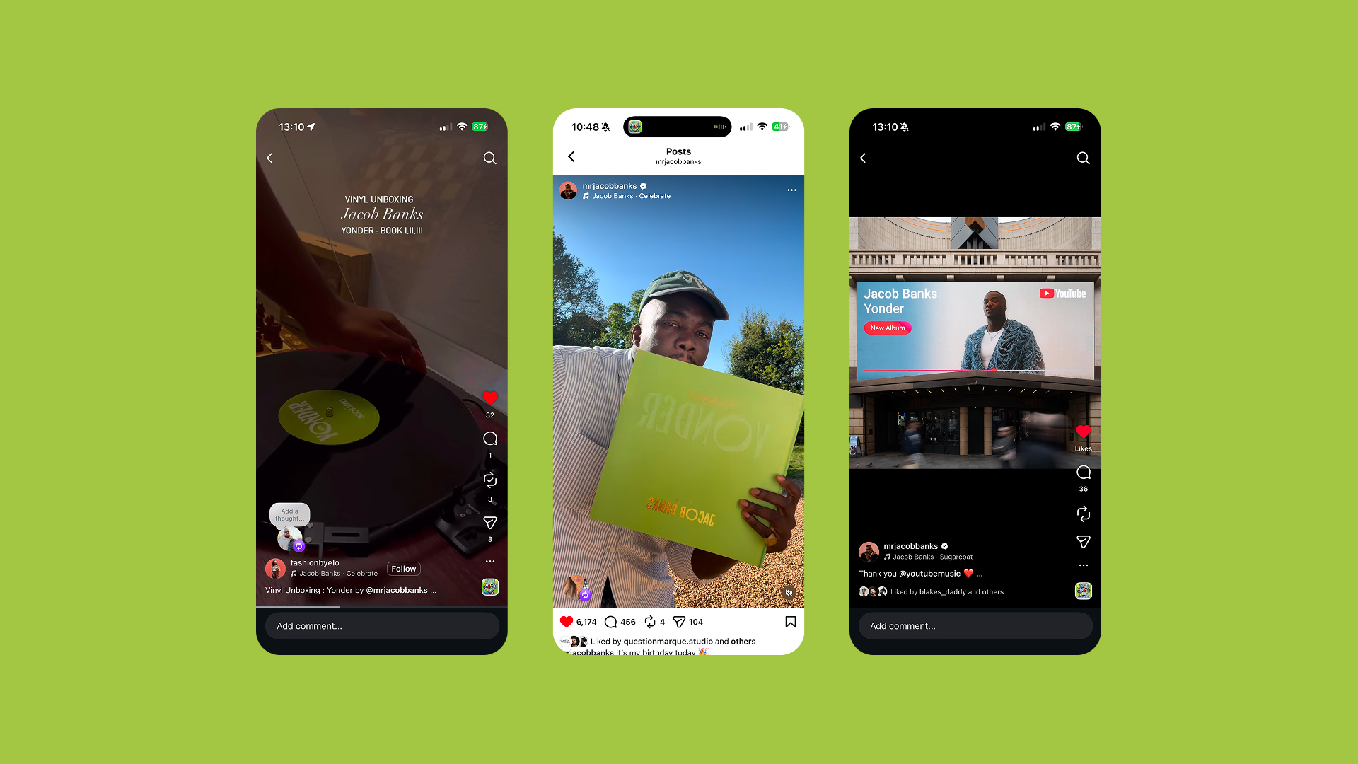
For each of the three books, we worked with South African artist Njabulo Hlophe to bring a series of original paintings into the project. These artworks became the foundation of each release—subsequently animated to create moving album artwork and a full suite of lyric videos for every track. The motion added depth and atmosphere, transforming static pieces into living visuals that carried the tone of the music.
As the three books unfolded, each became its own moment—allowing the project to grow over time rather than peak at a single release point.
The final phase brought everything together as The Complete Collection, where the project was recontextualised as a singular body of work. The physical execution leaned into this concept fully, with the album presented as a book—both visually and conceptually—bringing the narrative structure to life in a tangible format.
Alongside the music, we developed a premium capsule collection that moved beyond traditional tour merchandise. Built around the theme of three, the collection featured three distinct pieces—each inspired by a different sporting discipline: a football jersey, a track and field jersey, and a racing-inspired knit/jacket. Each piece reflected a different facet of the project, reinforcing the structure and storytelling behind Yonder.
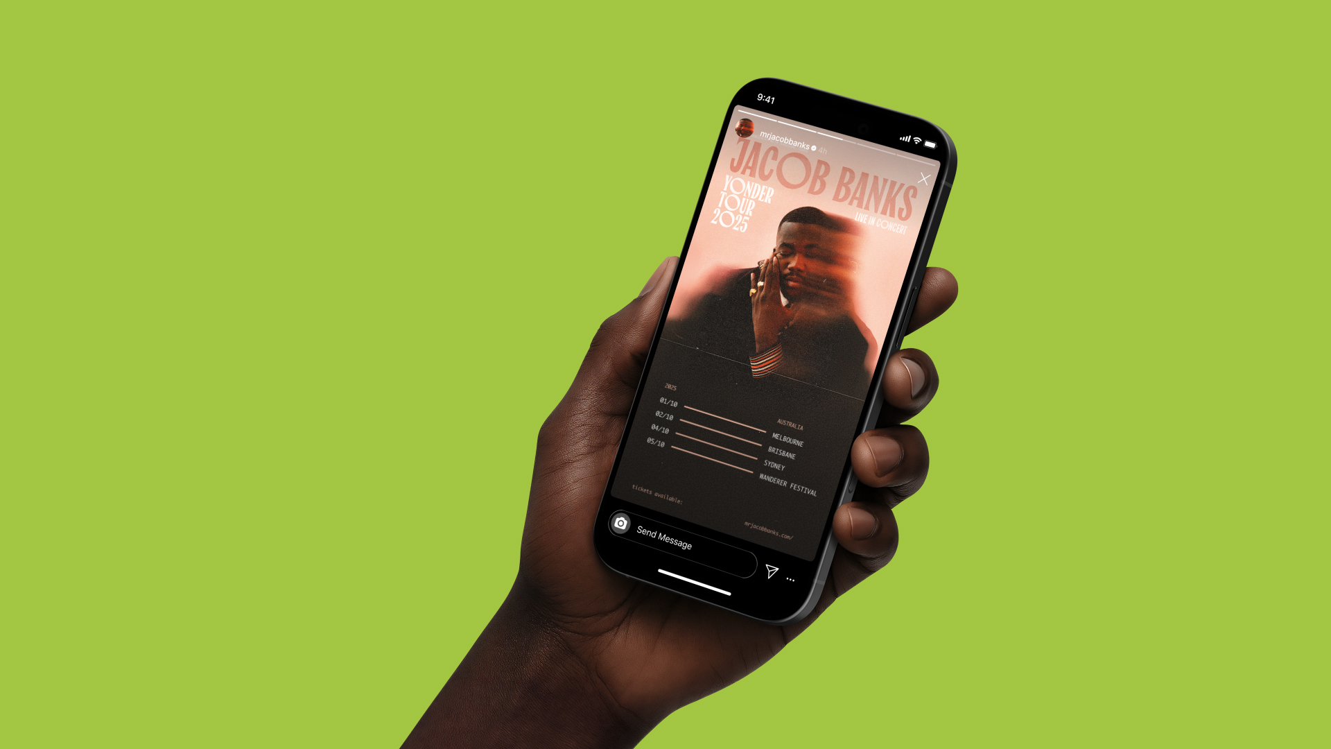
The visual system extended into the tour identity, carrying through the typography and overall aesthetic to ensure continuity across live performance, social rollout and promotional assets. From digital artwork to stage visuals, every touchpoint was considered as part of a single, evolving world.

The outcome
Yonder was realised as a layered, multi-chapter release—one that unfolded over time and rewarded audiences at each stage.
By structuring the project across three distinct releases, the campaign sustained momentum and created multiple cultural touchpoints, rather than a single moment. Each phase added depth to the narrative, culminating in a complete collection that felt both cohesive and considered.
The integration of artwork, motion, merchandise and live identity allowed the project to exist beyond music—positioning Yonder as a fully formed creative world.
Our continued collaboration with Jacob reflects a shared approach to building projects that are not just released, but experienced.


Related Projects

Jacob Banks — Lies about the War
