Green Island Festival
Green Island is a grassroots music and arts festival based in Manchester, UK, with a strong focus on community, nature, and underground culture. Held in the leafy setting of Hulme Community Garden Centre, the event offers a unique alternative to the commercial festival circuit—intimate, high-energy, and deeply connected to its environment.
Each year, Green Island presents a series of one-day “volumes” across summer and autumn, showcasing over 60 emerging and underrepresented artists across genres like hip-hop, neo-soul, jazz, electronic, ska-punk, and more. With its jungle-like setting, values-led programming and creative street food offerings, the festival is as much a celebration of local community as it is of music.
By its fifth year, Green Island had established a loyal following and a distinctive atmosphere. What it needed next was a brand identity to match its ambition.
The opportunity
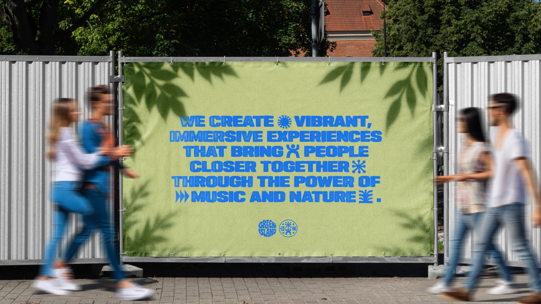
Green Island approached us to lead a full rebrand and website refresh following a sustained period of growth. The festival had evolved year on year—and 2026 marked both its sixth anniversary and a clear step into a more confident, scaled-up future. Working closely with their marketing director, we helped define a new creative direction rooted in Green Island’s values: creativity, inclusivity, independence, and nature.
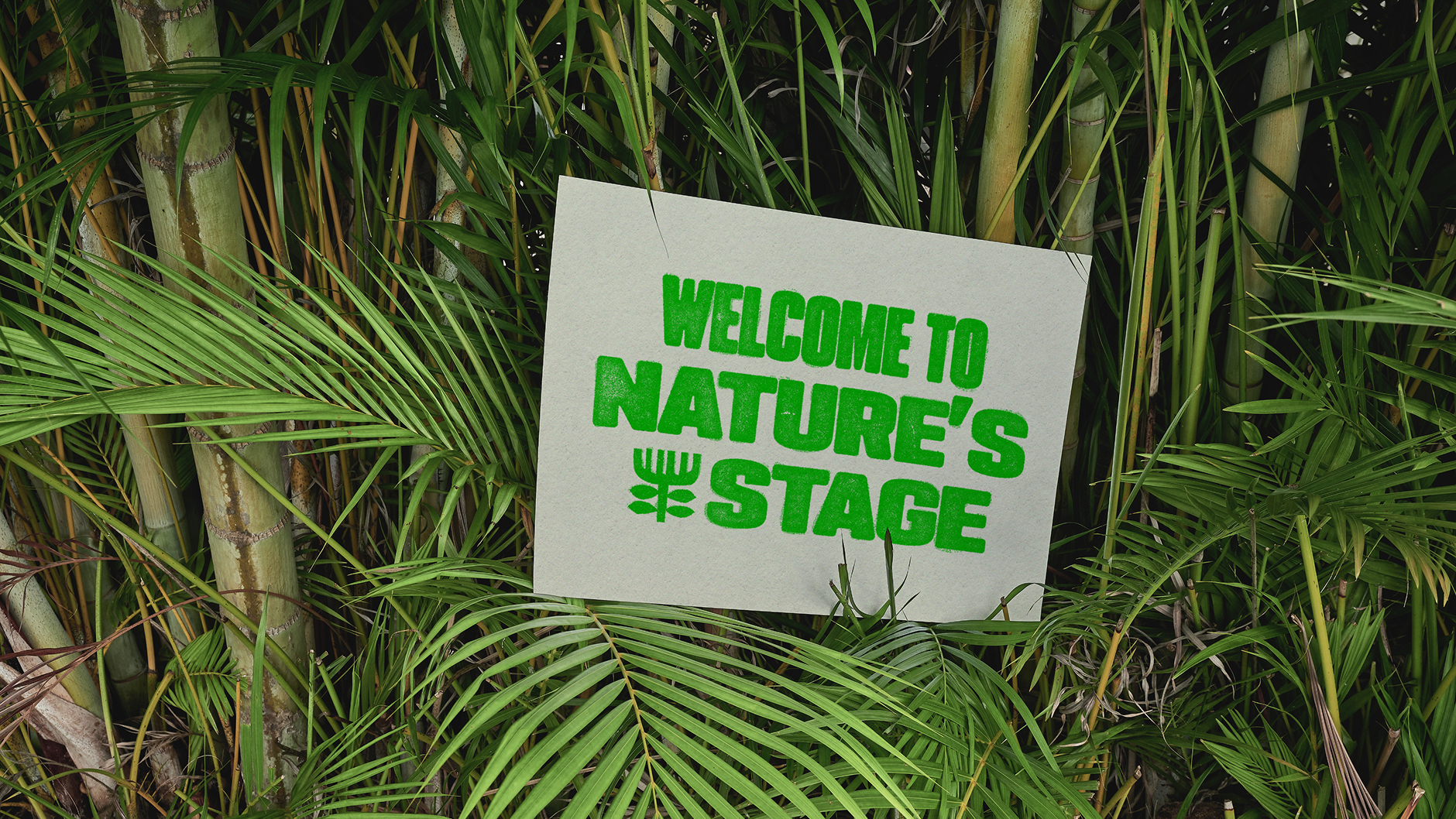
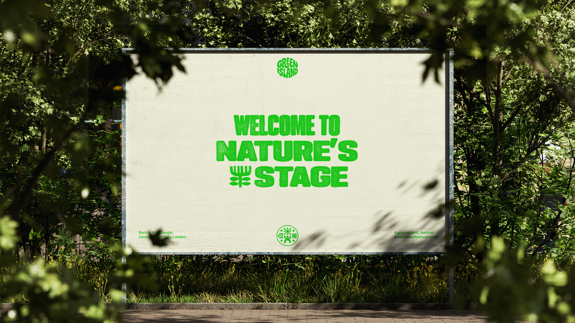
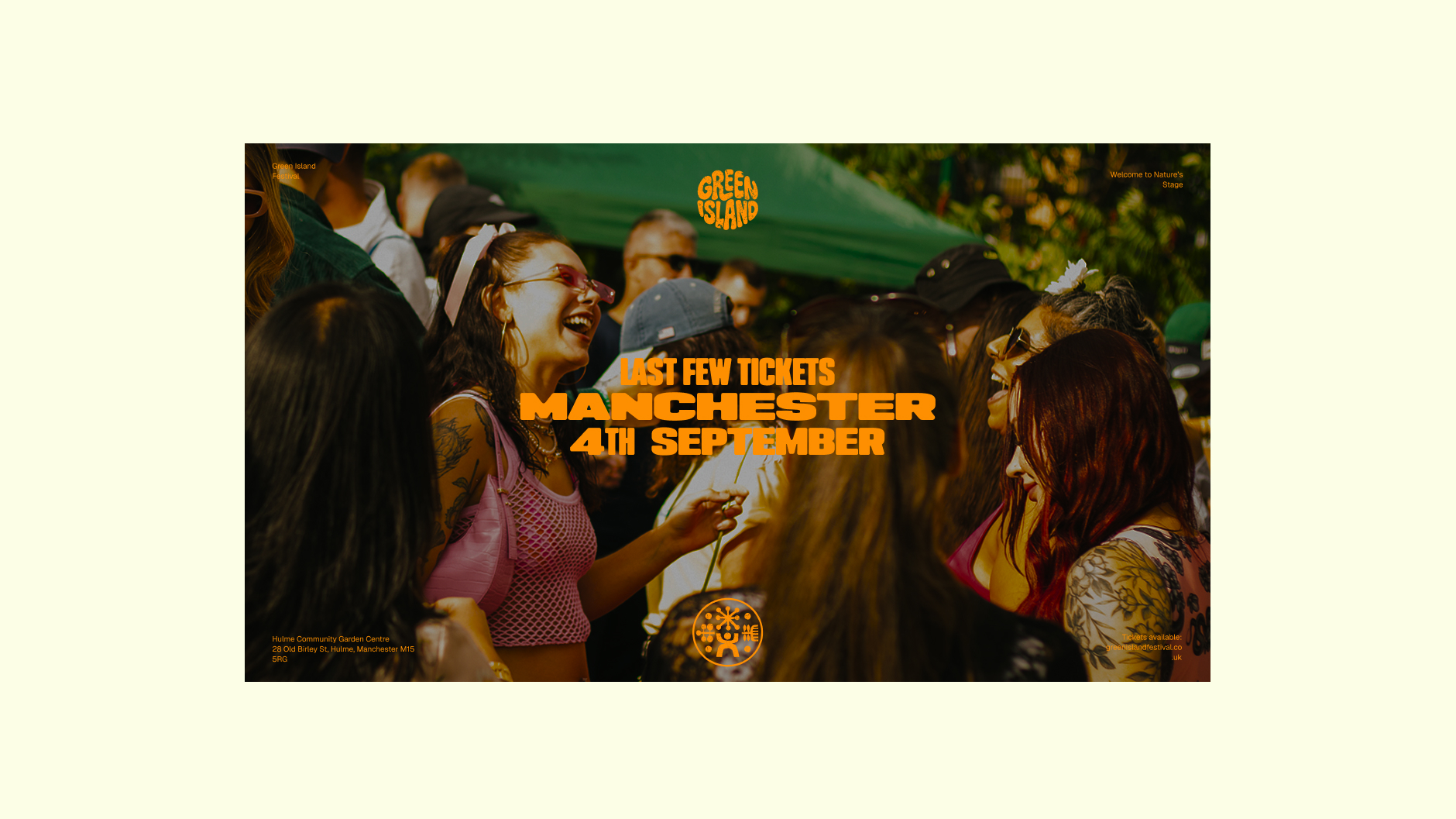
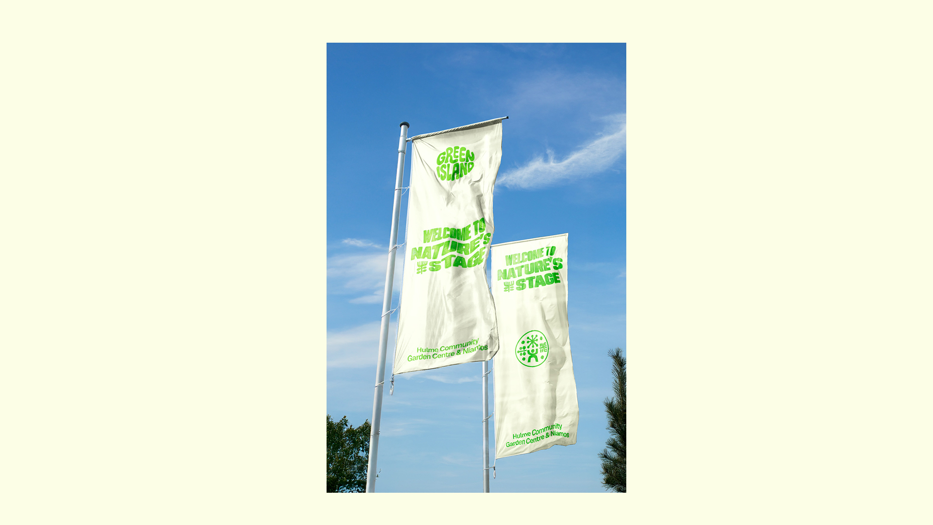
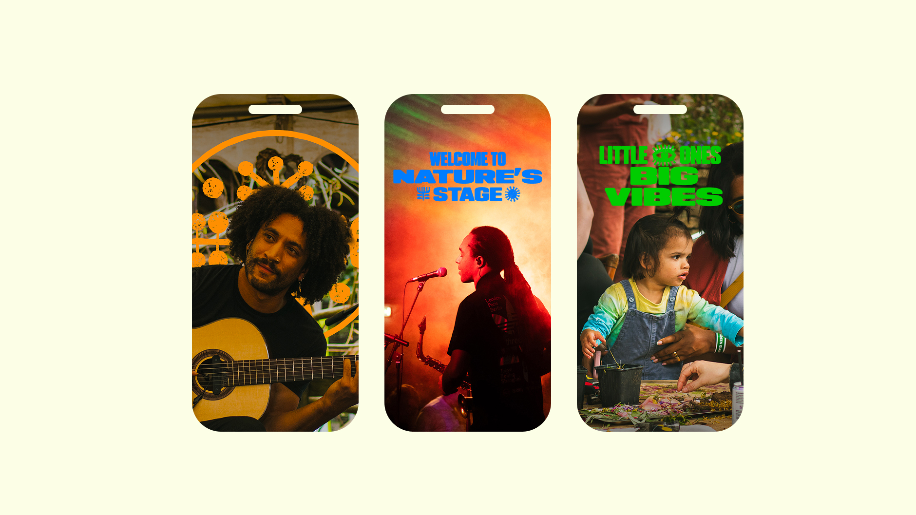
We introduced a new brand positioning and festival strapline—“Welcome to Nature’s Stage”—designed to capture both the spirit of the setting and the community-led energy of the event. It became the guiding idea behind both the visual and verbal identity.
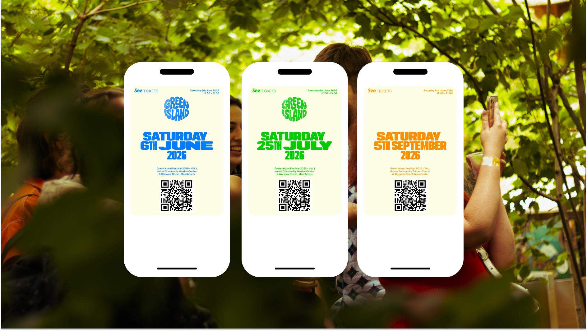
In parallel, we redesigned the festival’s website to support its 2025 edition—introducing a new lineup structure, improved navigation, and a dynamic artist filtering system. This digital framework then served as the foundation for the expanded 2026 site and rebrand rollout.
What we did
This was a full creative overhaul—but one rooted in evolution rather than revolution. Green Island wanted to retain elements of its existing logo and recognisability, while signalling the start of a new chapter.
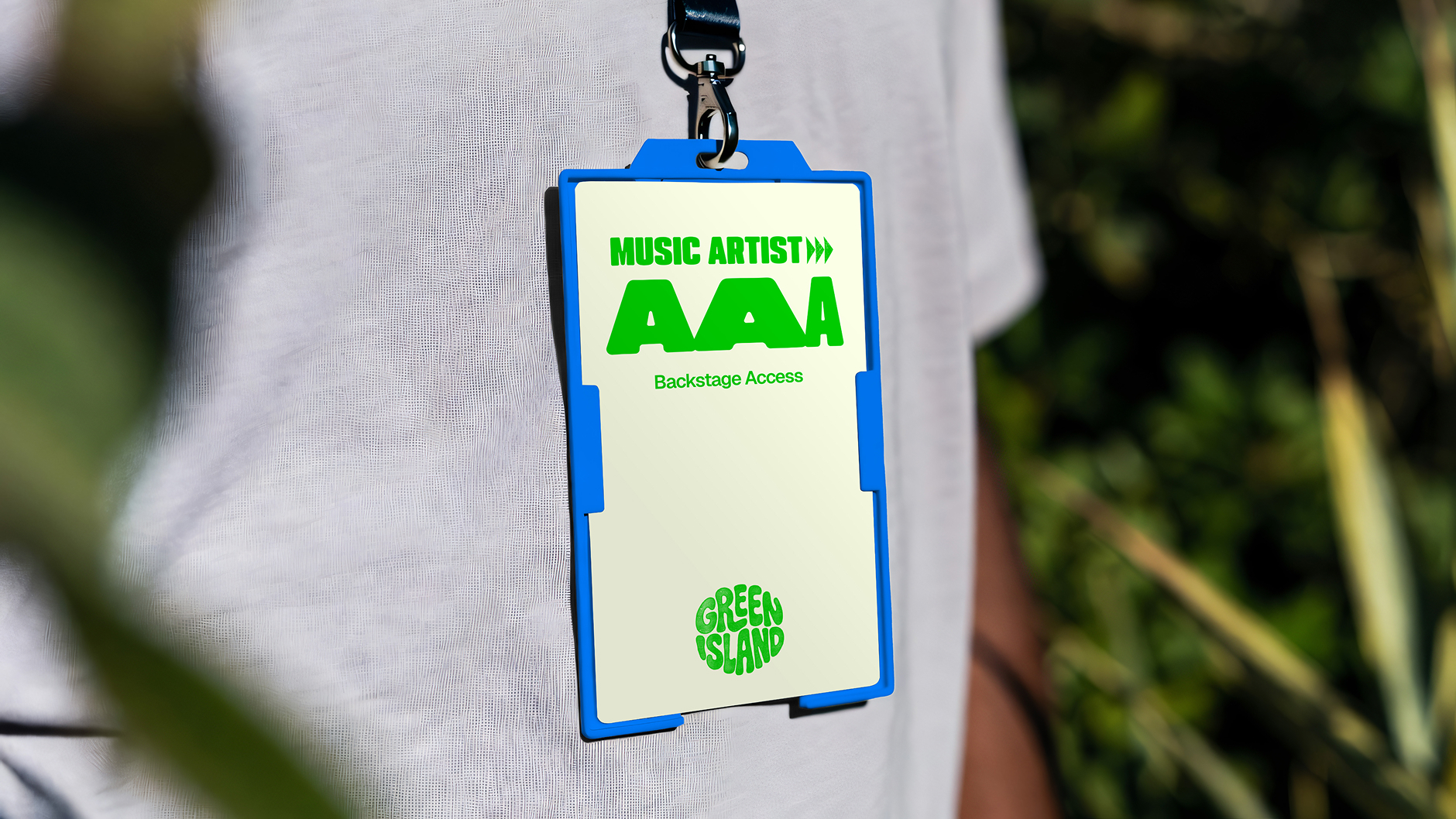
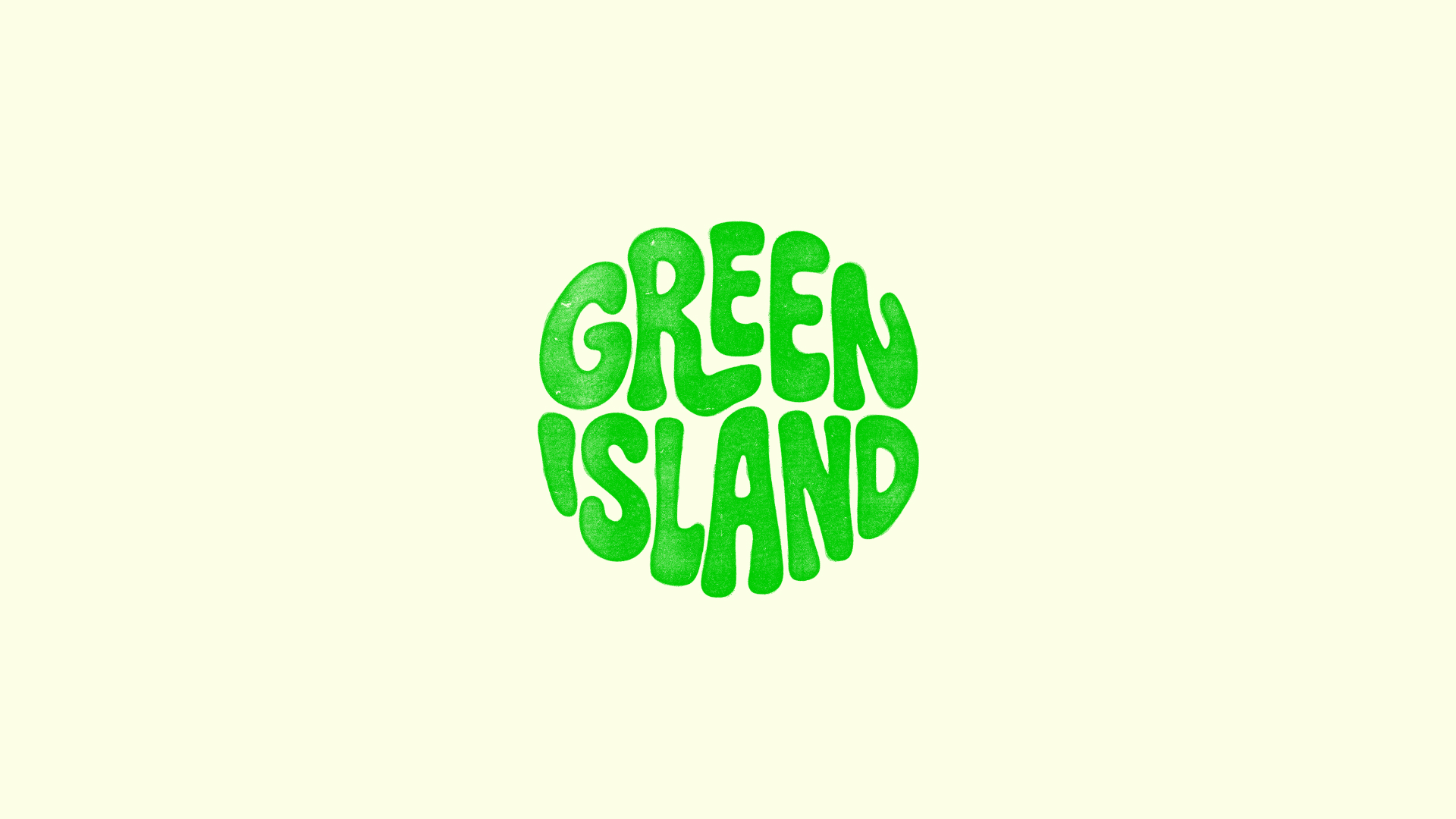
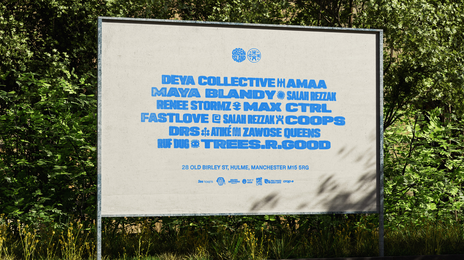
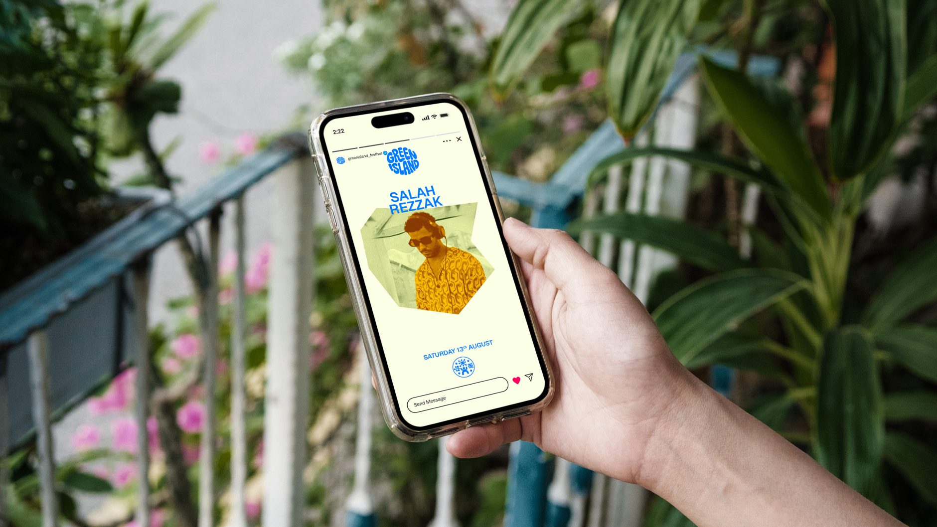
We began by dropping the word “Festival” from the brand name to build more equity in “Green Island” as a cultural brand in its own right. The updated logo system retained the circular format and tribal spirit of the original, but refined the wordmark into a custom, all-caps design with subtle nods to 60s/70s hippie aesthetics. A new standalone tribal symbol was also developed as part of the lockup, building flexibility across print, digital, and merchandise applications.
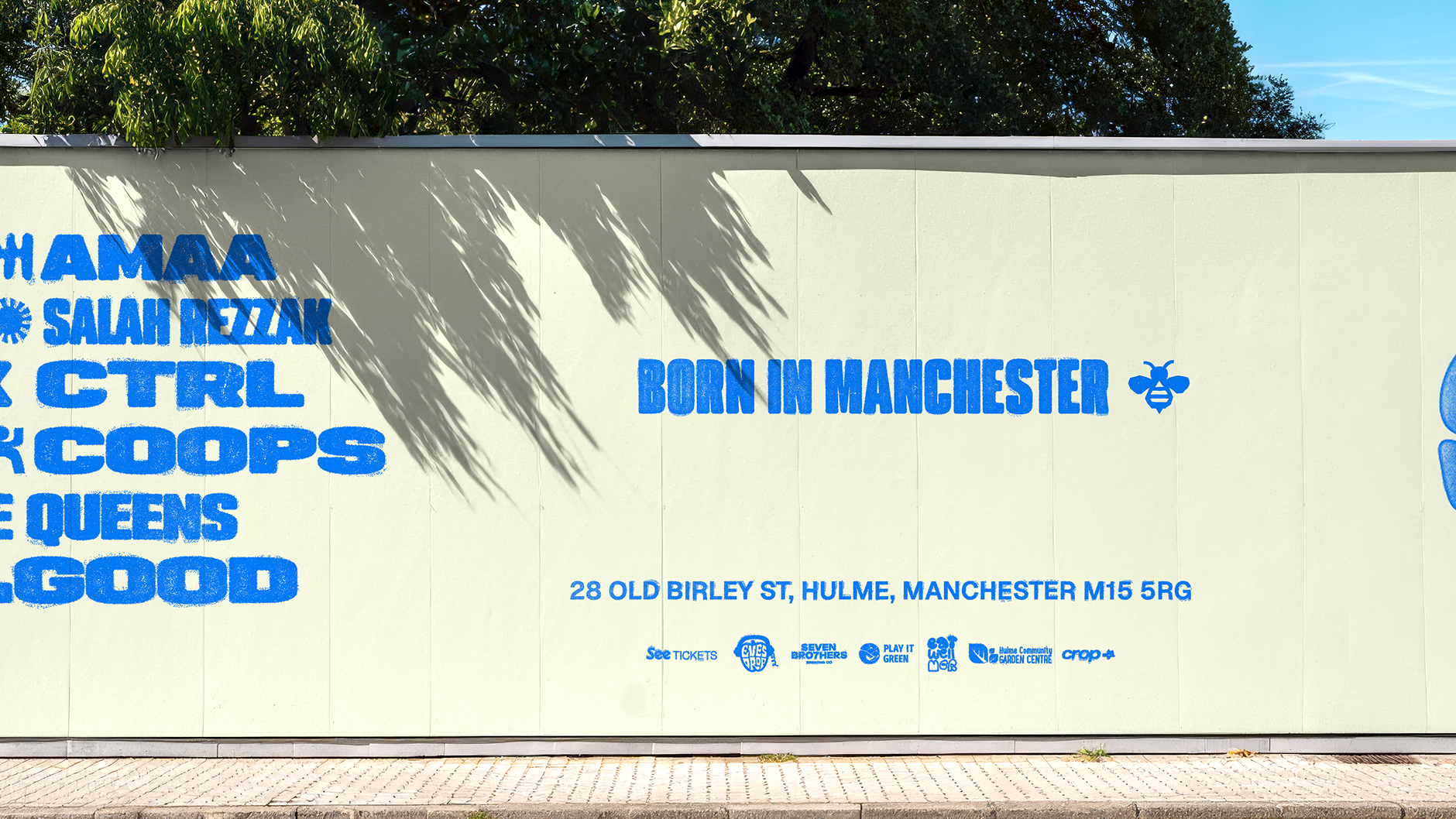
The wider identity took inspiration from DIY zines, handmade posters, and early rave culture. We leaned heavily into screen-printed textures, using rough layers, edge bleeds, and visual noise to give the system energy and depth. These tactile elements were balanced by a three-colour primary palette—neon-like tones chosen for impact across both digital and OOH environments.
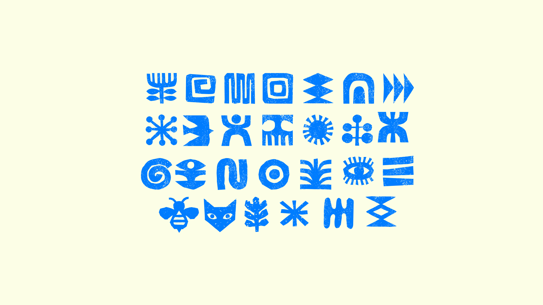
A custom icon suite sits at the core of the brand system—each symbol rooted in meaning. From the Manchester worker bee to tribal-like glyphs representing nature, unity, and community, the icons were designed to weave through headlines, act as image holders, or stand alone as recognisable brand markers.
The typographic system is equally expressive. A bold display face offers a range of weights and styles, taking cues from 90s and early 2000s rave flyers—allowing the brand to feel rhythmic, responsive, and energetic across formats.
Everything was built to scale. From digital toolkits to layout systems and content templates, we created a brand that could grow with the festival—without losing its grassroots spirit.
The outcome
The new identity soft-launched at Green Island’s presale party ahead of the 2026 festival, marking what the team described publicly as “the next chapter” of the brand. Social rollout was met with enthusiastic feedback, with early content announcing “a fresh look” and “a flavour of what’s to come for 2026.”
Press coverage so far has focused on the wider success of the festival and its model as a community-driven alternative to commercial events—reinforcing the very story the rebrand was designed to help tell.
Green Island now has an identity and digital presence that matches its ambition, without losing its character. A grassroots festival, reimagined for scale.
We continue to support the Green Island team across ongoing web updates and digital content rollout.