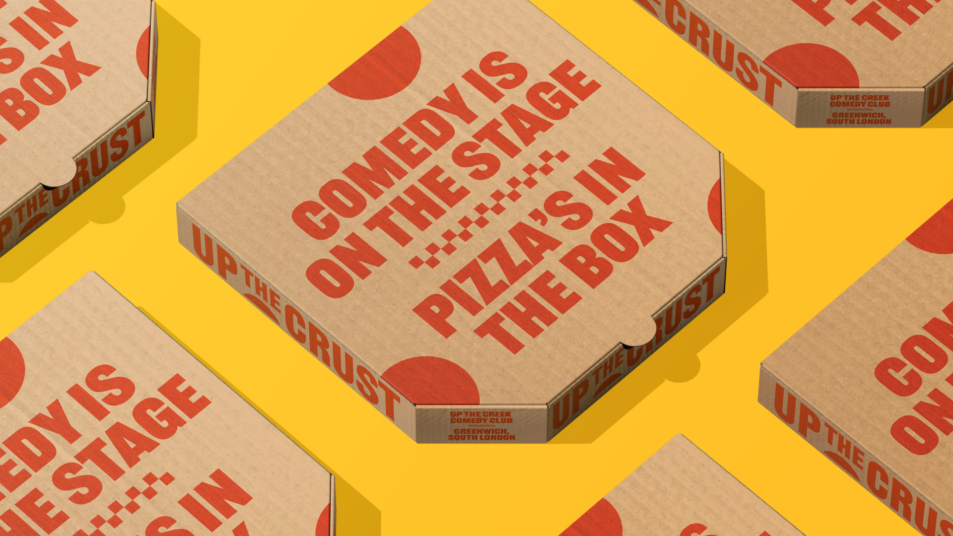
Up The Crust
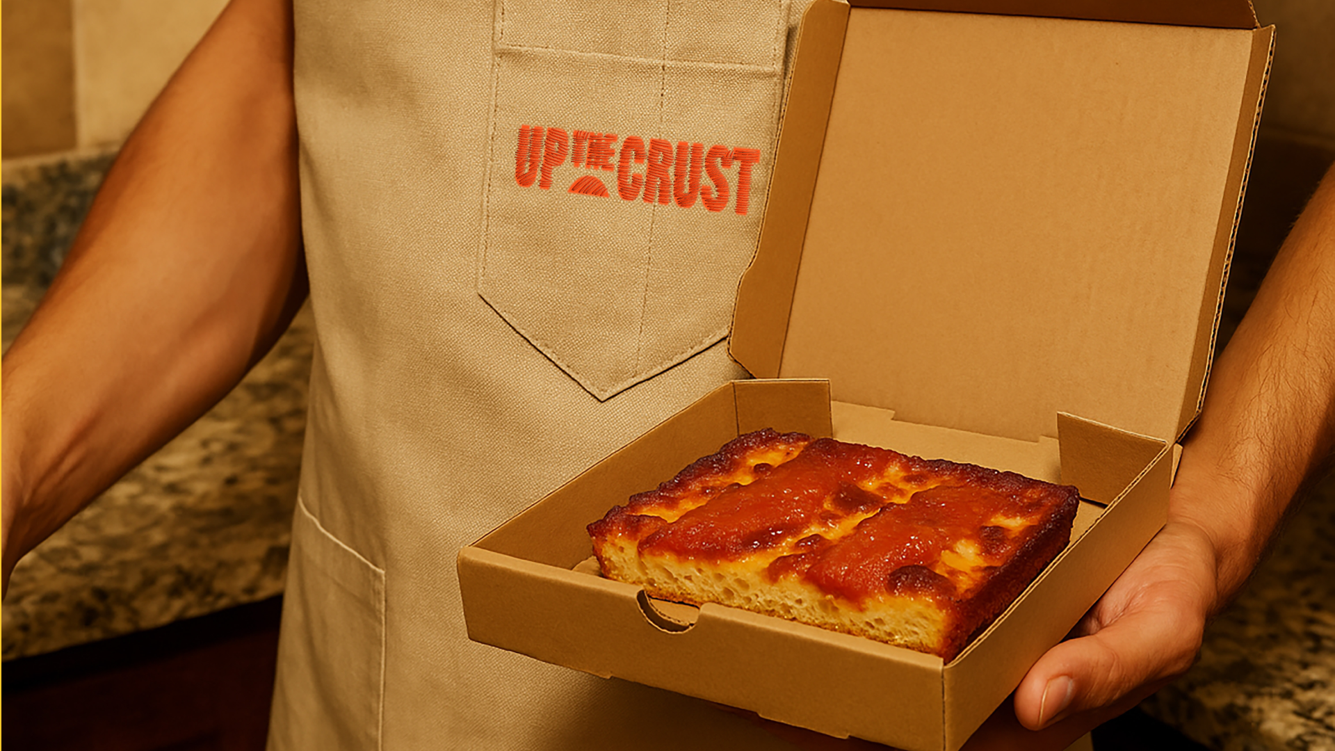
Up The Crust is a Detroit-style pizza restaurant based inside the iconic Up The Creek comedy club in Greenwich, South London. Serving bold, square-slice street food in a venue known for world-class stand-up, it’s a brand built to make noise—on the plate and off.
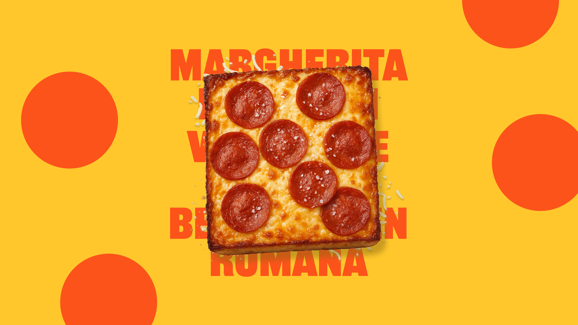
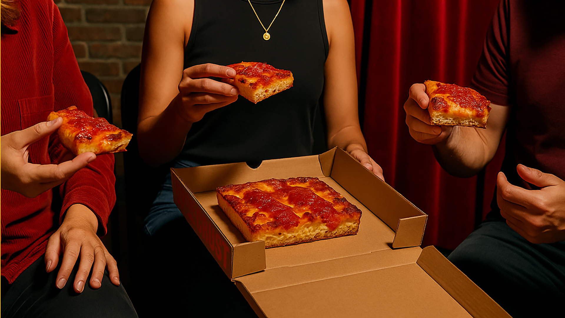
Detroit-style pizza is still a rarity in the UK. Unlike traditional Neapolitan or New York slices, Detroit pies are thick, rectangular, and edge-to-edge crispy with caramelised cheese crusts. Up The Crust taps into this underrepresented style with full confidence, bringing a slice of attitude to a borough already full of great food—and doing it with unmistakable South London flair.
The opportunity
Up The Crust replaced a previous food offering inside Up The Creek. While the club has its own built-in crowd and even its own brewery, the client knew the new restaurant had to do more than just serve food—it needed to stand out in a crowded local scene, capture attention in a live entertainment venue, and build something that could eventually live beyond the club.
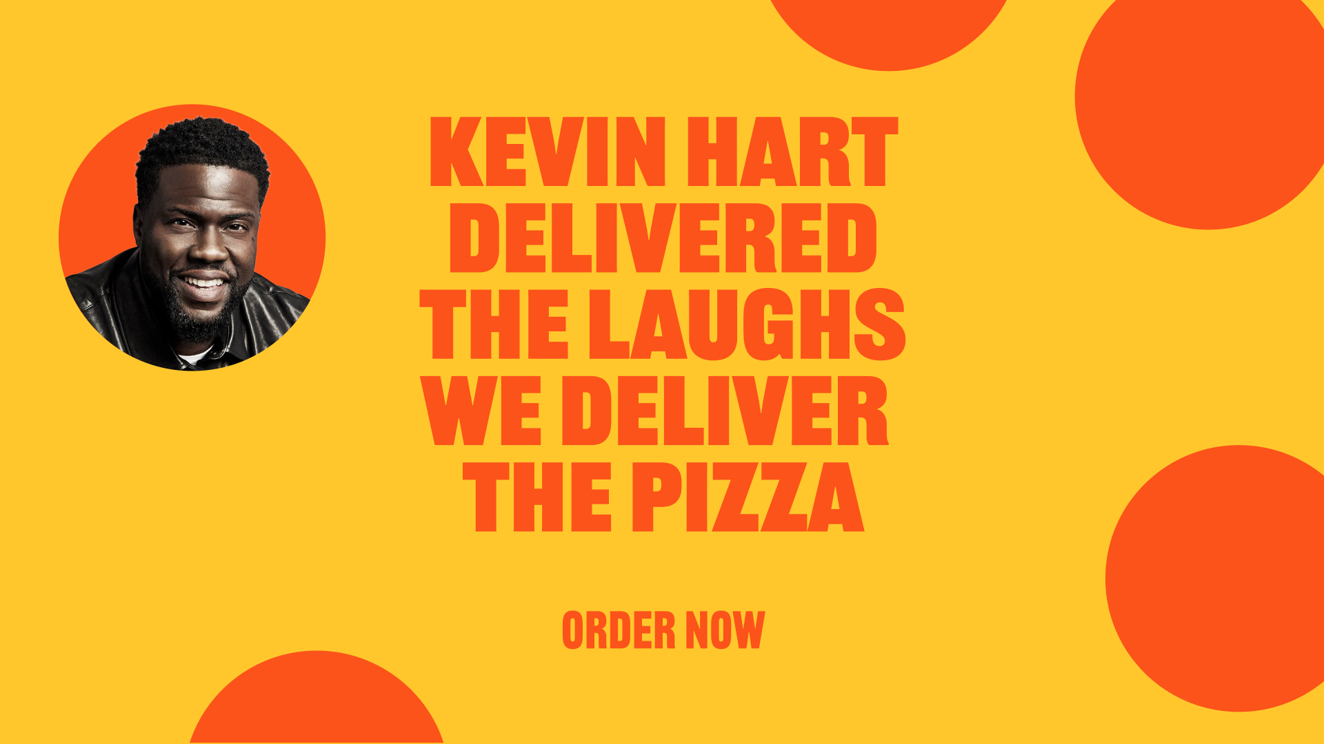
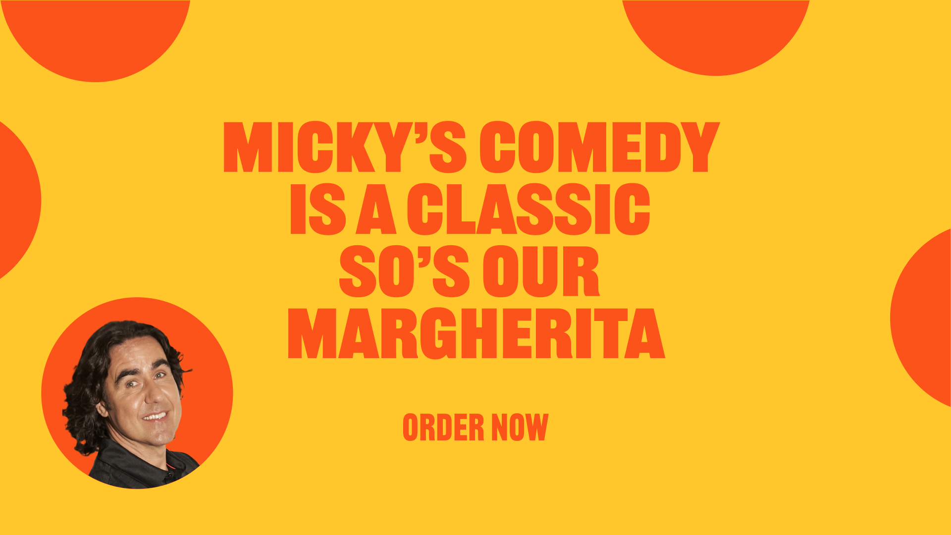
With just weeks to turn it around, we were brought in to create the brand from scratch. The connection to comedy was baked in from day one. Up The Creek has hosted everyone from Kevin Hart and Mo Gilligan to Micky Flanagan and James Acaster—and with Question Marque’s own deep ties to the entertainment world, we saw the perfect opportunity to create something that would feel culturally rich, visually iconic, and instantly like it belonged.
There was no formal brief. No time for workshops. Just a name, a location, and a tight window to deliver. The rest was up to us.
What we did
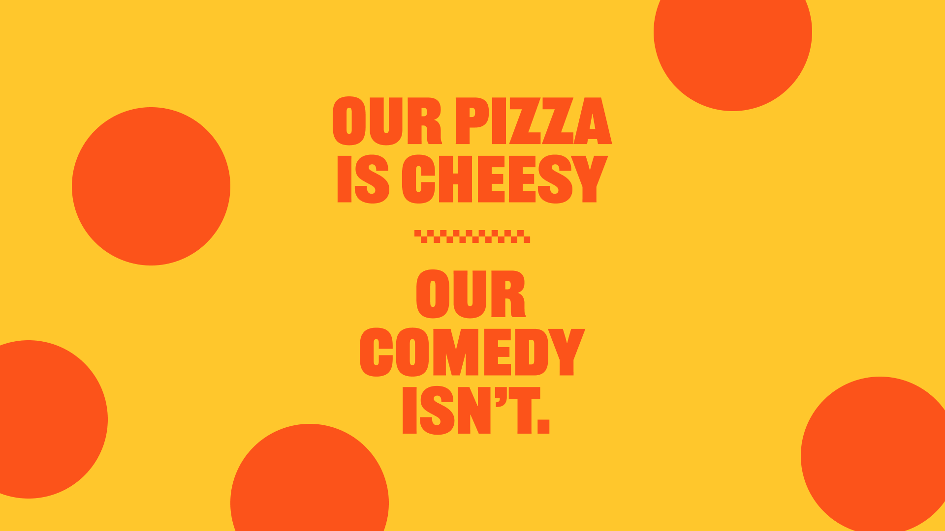
We built the brand identity around simplicity, punch, and visual wit—three traits shared with the comedians who grace the stage next door. The goal was to make Up The Crust feel established and unmissable, but not overdesigned. This wasn’t about trendy food branding—it was about creating something people would remember.
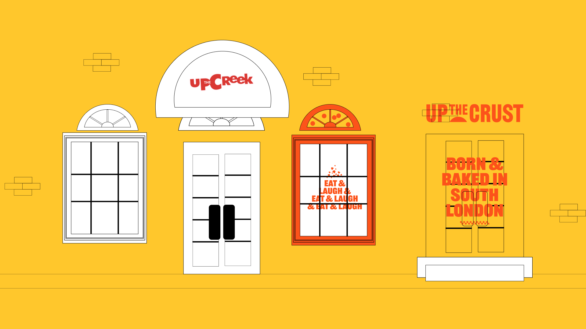
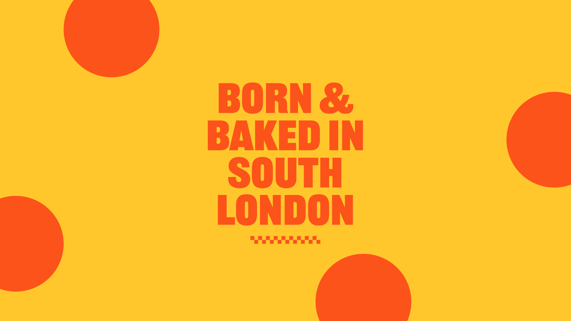
The identity uses a strict two-colour system: red and yellow. The yellow evokes warmth and attention, while the red takes the form of a recurring graphic motif—large, flat circles that reference both pizza slices and comedic timing. This visual system is reinforced with strong, condensed typography and messaging that’s deliberately short and snappy. Like a good one-liner, nothing outstays its welcome.
We developed the full visual identity and brand messaging, including brandline, in-venue signage, motion graphics, and launch content. The tone of voice was rooted in comedy without ever becoming gimmicky. We used puns sparingly, referenced famous acts who’ve played the club, and kept everything distinctly South London in spirit—bold, honest, and effortlessly cool.
The outcome
Since launch, Up The Crust has become a fast favourite—already outperforming the previous restaurant and expanding beyond the venue via Deliveroo. It’s carving out a name for itself not just as “the food at the club,” but as a standalone destination in its own right.
While our engagement ended post-launch, the brand continues to grow organically—both online and through word of mouth. With a standout food offer, a memorable name, and an identity built to flex across marketing and menus, Up The Crust is set up to rise.

Related Projects
Original Gummie Bears
