Hinter
HINTER is a woman-founded, majority POC and LGBTQIA+ strategic and creative agency based in New York, working with purpose-driven organisations across the globe. With a team of storytellers, strategists, producers and designers, they bring bold, human-centred ideas to life—whether through feature films, interactive campaigns, or strategic support that creates lasting change.
Their work spans sectors and continents, tackling some of the world’s most urgent challenges—from global health to climate action to justice for women and girls. And behind it all is a belief in elevating voices that often go unheard.

The opportunity
The agency was evolving. Known previously as Hinter Media, the team had outgrown the name and needed a sharper, more focused identity that reflected their current positioning: global, modern, multifaceted, and unmistakably bold.
They approached us with a clear direction—to drop “Media” from the name, update their identity system, and redesign their website to showcase the full breadth of their recent work. They wanted something stylish and editorial, something that could carry the weight of their clients’ missions while feeling fresh, fashion-forward, and global.
With a growing client roster—including names like Elemental Excelerator, Goals House, Pfizer and Pathfinders for Justice—it was time for HINTER to look as powerful as the work they deliver.
What we did
We began by stripping things back. The word HINTER alone carries strength—so we leaned into that, removing “Media” entirely and refining the word marque to feel assertive, clean and confident.
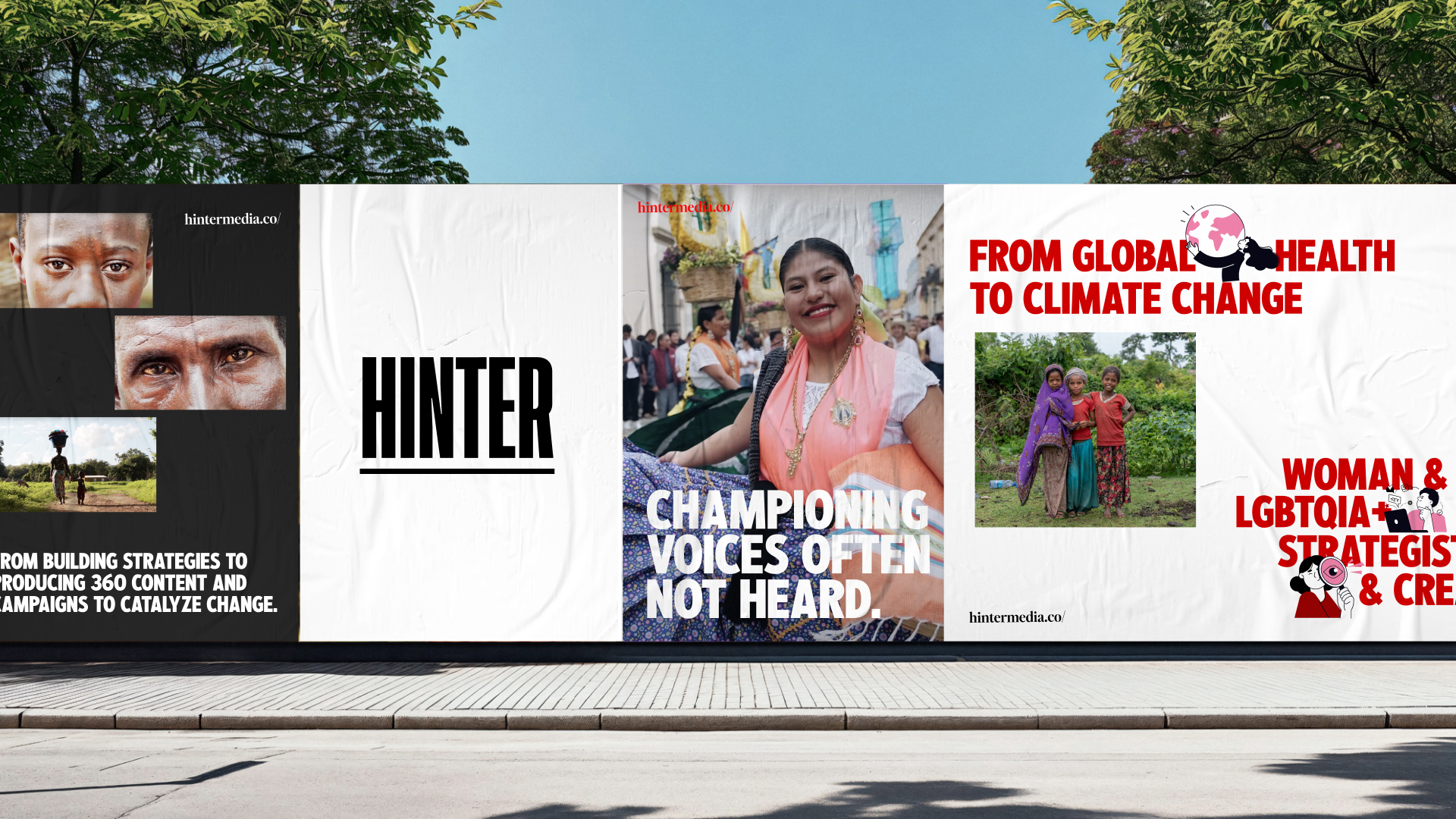
The new logo uses a bold, narrow, all caps typeface — set with an underline to visually reinforce the grounded strength at the heart of the agency’s work. The type is stark and elegant, with a hint of press-style authority. To complement it, we introduced a secondary serif to use across decks and collateral, adding contrast and editorial flair.
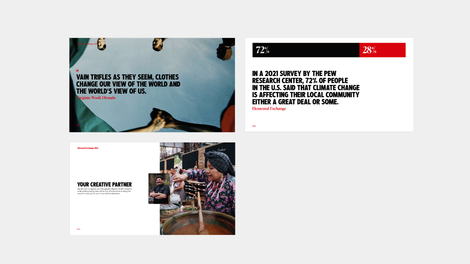
Inspired by the agency’s storytelling roots, we introduced a black, white and red palette—referencing classic print media and giving the brand a timeless but punchy presence. The overall aesthetic is modern, minimalist, and distinctly global.
We created a suite of animated logos where the word marque splits open to reveal the agency’s strapline—“We Tell Good Stories”—or dynamic visuals from past projects. Each version puts the work, the client, or the message at the centre, reinforcing the idea that HINTER is a platform for impact.
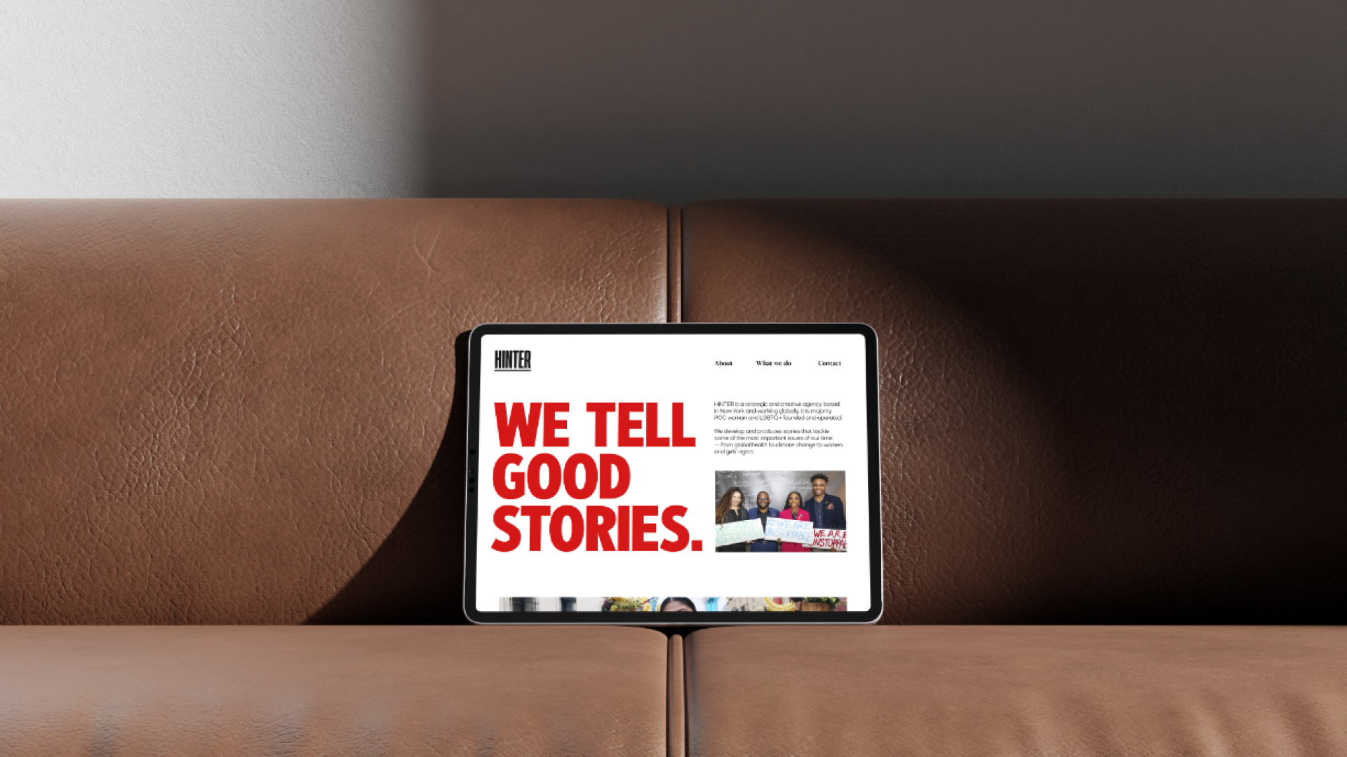
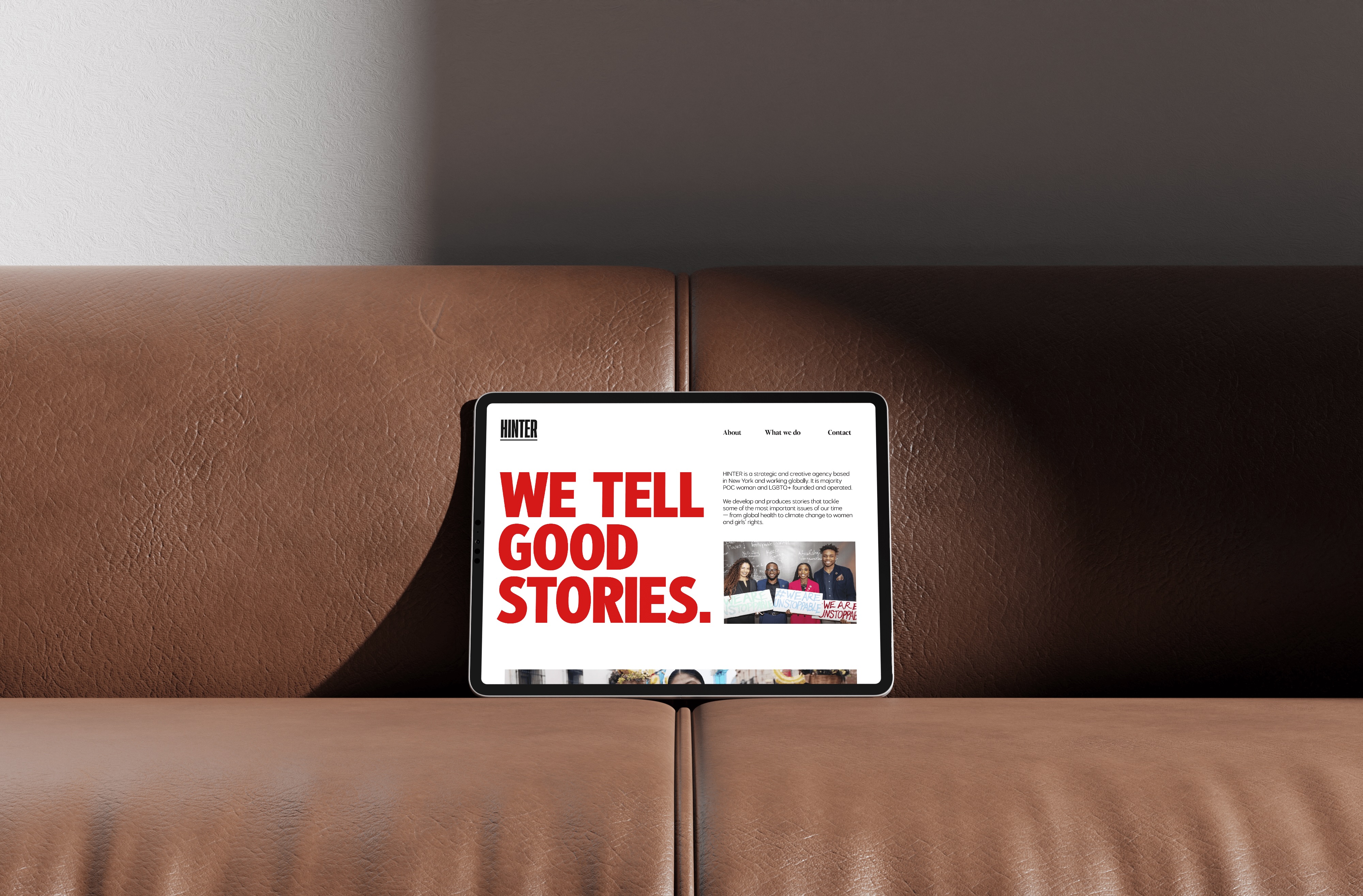
Alongside the identity, we delivered a full website refresh, built around a fullscreen video-first homepage. The experience feels immersive and bold from the first interaction—helping the agency immediately communicate the scale and visual nature of their work. We also designed flexible, elegant templates for email newsletters and pitch decks, ensuring internal comms reflect the same high standard as client-facing work.
The outcome
HINTER’s refreshed identity brings clarity and confidence to a studio already doing meaningful work around the world. The new system reflects the strength of their voice and the purpose of their platform, while giving them the tools to show up consistently across digital, editorial and strategic spaces.
The rebrand sets the foundation for the agency’s next chapter—one rooted in creative excellence, global storytelling, and community-first thinking.


